
Renko Charts Explained: Brick Sizes & Setups

You can trace renko chart’s origins to Japan and they were first introduced to the West by Steve Nison in his book “Beyond Candlesticks”.
The actual word renko is derived from the Japanese word renga, which means bricks. Renko charts are similar to kagi charts and the three-line break charts except that the renko chart is drawn in the direction of the primary trend and have a fixed size.
Renko charts are also similar to point and figure charts as each brick is the same size.
So, in order to generate an opposite color, the fixed brick size of the Renko must be exceeded. This of course classifies renko charts as a lagging indicator and in choppy markets can lead to a number of false signals.
Renko Chart Example
Renko charts are used to determine potential changes in price trend. Below is a chart pattern example with renko bars.
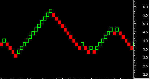
Renko Charts
Constructing Each Brick
The first thing you need to do is construct each brick which are the “building blocks” (get it…) of the chart type.
There are two primary methods for building each brick: (1) ATR and (2) set price point.
ATR
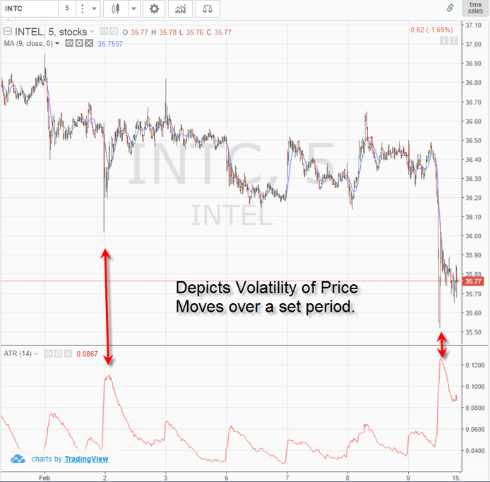
The ATR is a volatility indicator that measures the volatility of a security over a set period of time. To read more on the ATR, please visit this article, which goes into great detail.
Average True Range
The average true range looks at the high and low ranges of a security of the default 14-day period which creates the red line you see above.
ATR and Renko Charts
One of the challenges of charting Renko chart patterns or point and figure charts is that the size of each building block needs to be dynamic.
What does this mean?
Well if I set a box price when a security is 8 dollars, then should I keep the same box size when the security is 50 dollars?
As you can imagine, if I set the box size to 25 cents, I will have far more building blocks print when the value of the security is at 50 versus 8.
This is where the ATR helps close the gap.
Essentially you look at the ATR value and use this as a dynamic means for creating the Renko brick size.
So, if the ATR value is 15, then that is the size of the brick. This size value is again dynamic as the security prints ATR values.
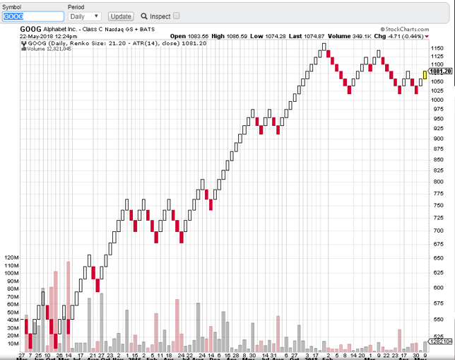
Renko with ATR
This brick size is based on the closing price of the security.
High/Low Close Range
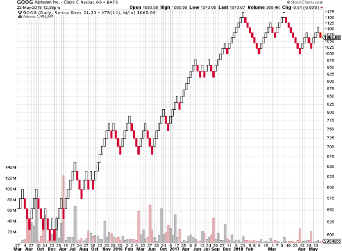
You can also select the option to have the renko chart pattern constructed based on the high and close range for the day. To see this, check out the below chart.
ATR with High Low Range
The above chart has more bricks due to the expanded price action that can occur between highs and lows.
If you are looking for a more accurate reflection of the price action, you will want to use the high low method to construct the brick.
Set Value
The next approach you can use is to construct the brick based on a set value. The value you select is solely up to you and should capture the price move of the security.
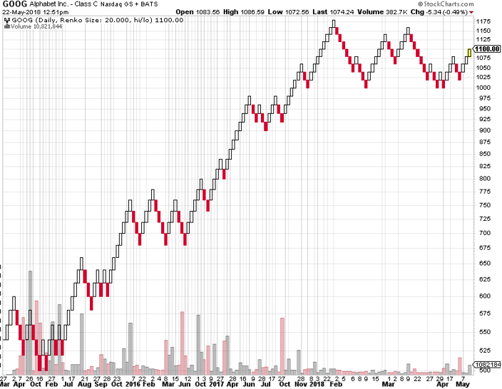
Renko with Set Price
In the above example, we used a set value of 20 points per brick. As you can see, the number of bricks increased as Google broke 1,000.
Set Percentage
What I personally like the most to do is to set the price based on a set percentage of the security itself. This way if you develop a price target based on a number of bricks, this target will hold up as your security moves higher.
Using a set percentage gives you the flexibility of a dynamic brick, but it’s more relative to the actual price of the security and not based on a technical indicator like the ATR.
So Why Use Renko Charts?
Now that you understand how the bricks are created, the next thing we need to cover is why use Renko charts?
I use candlesticks and point and figure charts, but I do understand why someone would trade with Renko chart patterns.
The real benefit of Renko charts is that it quiets all the noise in the market. If you haven’t figured it out yet, the market is one big game of head fakes.
Candlesticks, while the de facto standard, creates wicks and huge red candles that can shake the nerve of the best of us.
Well renko charts removes all the noise and allows the price action that matters to come through.
Ranges
Instead of looking to renko charts to determine price targets or applying moving averages to determine when a trend ends – what about simply looking at renko charts to identify ranges?
Why identifies ranges? Identifying the ranges further allows you to filter out trading activity of no-consequence.
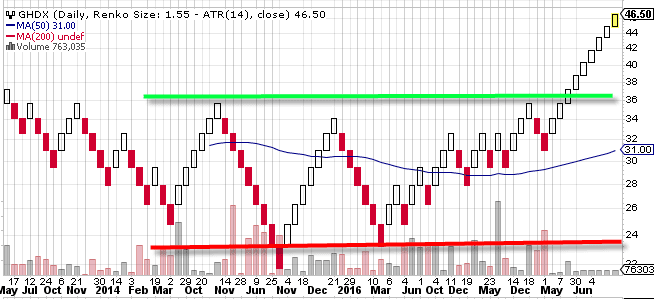
Renko Range – Chart 1
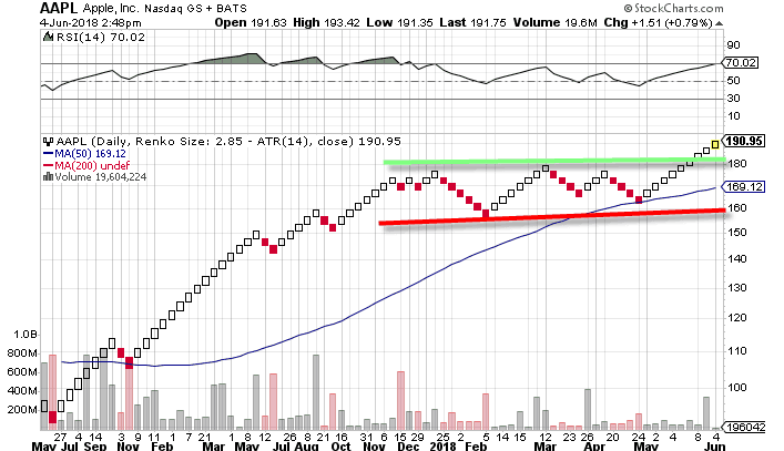
Renko Range – Chart 2
You could be asking yourself, “Well can’t I see this on a candlestick chart?”.
The short answer is yes, but there would be far more candlesticks printing on the chart which could lead you to misinterpret the action.
The key to the market is knowing when to not place a trade and the more you stare at the screen the more likely you are to feel the need to do something.
In the above examples of both GHDX and Apple, the key takeaway was to avoid placing any new long breakout trades until the stocks were able to clear their respective resistance levels.
As you can see, once these key levels were breached, each stock began strong upside moves.
Flaws of Renko Charts
Like any indicator, Renko charts are not perfect. While it is great at times to quiet all the noise, there are instances when details matter.
Trendlines
For example, if you are looking at an uptrend line, this could be completely missing from a Renko chart. Therefore, a dynamic support area could be right in front of you, but this line could be invisible to the eye.
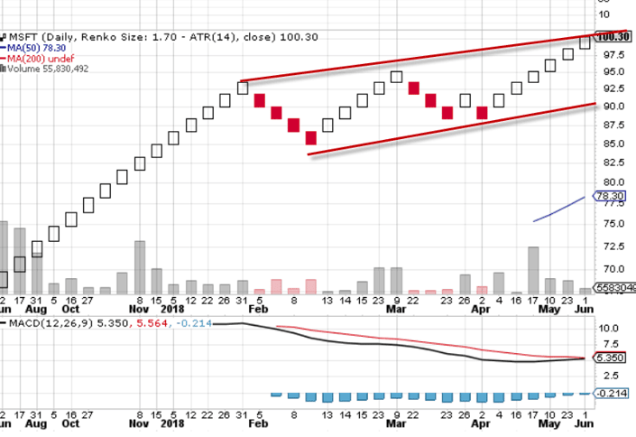
Renko Trendlines
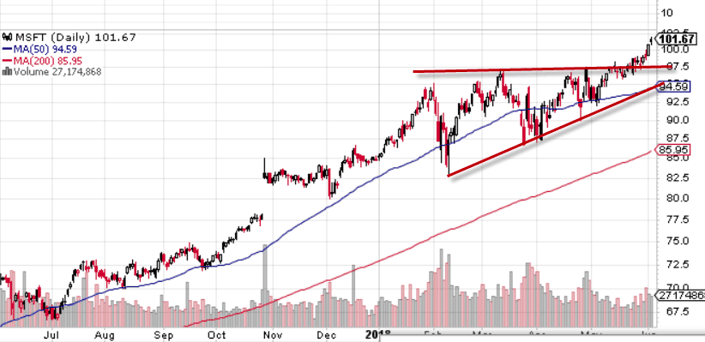
Candlestick Trend lines
If you compare these two charts, you will notice how the second touch point on the support line at $87.50 never printed on the Renko chart. Also, the candlestick pattern developed a symmetrical triangle, while the Renko chart is in an uptrend channel.
These two patterns have two completely different price targets.
The symmetrical triangle will have a target the width of the pattern, while price will oscillate within a channel until breaking in one direction.
As you can see, trying to use both charts will likely lead to more confusion than clarity.
Therefore, as previously stated, you are best off using the Renko chart pattern as a method to identify ranges or support and resistance levels irrespective of time.
Setting Stops/Profit Targets
One of the most important things in trading is keeping the profits you have made on a trade. There is nothing worst then being up on a position, only to give back your gains.
Usually the time it takes to give back the money is much faster than it takes to accumulate it.
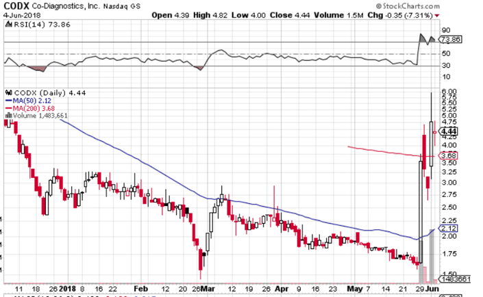
Parabolic Move
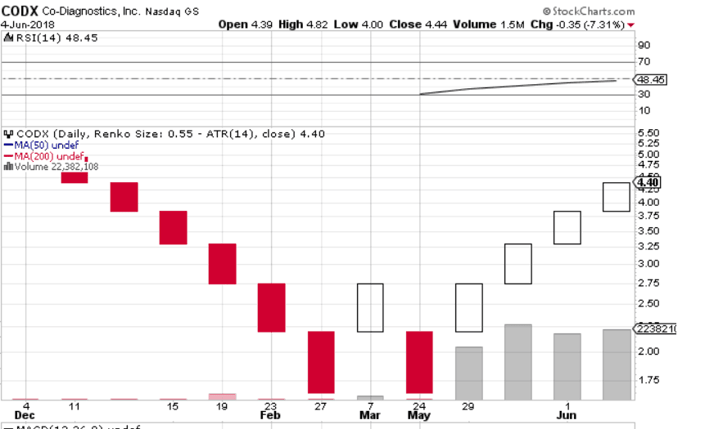
Renko Chart – Missing A Lot of Data
If you are a momentum trader do you see how much information is missing from the chart?
The tightness of the trading pattern makes for a mild ATR rating on the Renko chart, hence the brick is unable to capture the true strength of the trend.
Where would you place your profit target based on the Renko chart? How would you use the Renko chart to stop out of the position?
Renko charts make sense for a long-term investor as CODX is likely headed significantly higher. But for my Momo traders, the lack of data will likely turn a winning trade into a loser.
In Summary
Renko charts are a great tool for identifying major support and resistance levels.
However, if you are an active trader there is too much data missing from the chart that is critical to your trading success.
I am all for simplifying what is presented on the chart, but we can’t completely void ourselves of the trading decisions of the masses.
Choosing a Brick Size: A Practical Comparison
The four construction methods above are not interchangeable. Each one answers a different question, and picking
the wrong one is the most common reason a renko chart looks useless. Here is how they compare.
| Method | Brick size is set by | Best for | Main drawback |
|---|---|---|---|
| ATR | The average true range reading, so it adapts to volatility | Instruments whose volatility changes a lot over time | Brick size shifts underneath you, so historical bricks are not comparable |
| High/Low close range | ATR calculated on highs and lows rather than closes | A more faithful record of intraday range | Prints many more bricks, which reintroduces some of the noise renko is meant to remove |
| Set value | A fixed number of points you choose | Instruments that trade in a stable price band | Becomes wrong as the price doubles or halves |
| Set percentage | A fixed percentage of the current price | Holding a brick-count price target valid as price moves | Not supported on every charting platform |
If you are working through this on a platform that does not offer percentage bricks, our roundup of
free stock charting tools is a reasonable place
to check what is available. The same scaling problem that makes fixed-point bricks fail over long histories is the
one behind logarithmic versus linear price scales.
Renko Compared to Other Noise-Filtering Charts
Renko is not the only chart type that throws away time in order to show structure. It helps to know what else is
in that family and what each one discards.
- Point and figure: the closest relative. Also uses fixed-size boxes, but adds a reversal
requirement (typically three boxes) before a new column starts. Renko needs only one brick. - Tick charts: print a new bar every
N transactions rather than every N minutes. They filter time, not price, so they expand during busy
periods and go quiet in the lunch lull. - Kagi and three-line break: both Japanese, both direction-driven. Unlike renko, their line
lengths vary with the size of the move. - Candlesticks: discard nothing, which is the point and also the problem. See our
guide to candlestick patterns.
Because renko strips out time, volume-based context is worth adding back separately — checking
relative volume and
liquidity before acting on a brick reversal
covers the blind spot the chart type creates.
Renko’s lag is real and it is structural, not a settings problem: a brick only prints after price has already
travelled the full brick distance. Treat it as a way to see trend and range, not as an entry trigger on its own,
and pair it with a price action framework
and defined risk-to-reward levels. The most reliable way
to find out whether renko suits how you actually trade is to replay past sessions in a
day trading simulator and compare your fills
against what a candlestick chart would have shown you.
Renko Charts FAQ
What is a renko chart?
A renko chart is a Japanese chart type built from fixed-size bricks that print only when price moves a set amount
in one direction. Time and volume are ignored, so a quiet session may produce no bricks at all. The name comes from
renga, the Japanese word for bricks.
What is the best brick size for renko charts?
There is no single best size. ATR-based bricks adapt to changing volatility, a set percentage keeps brick-count
price targets valid as price moves, and a fixed point value works only while the instrument trades in a stable band.
Smaller bricks mean more signals and more false ones; larger bricks mean fewer signals and later entries.
Are renko charts lagging indicators?
Yes. A brick cannot print until price has already covered the full brick distance, so every renko signal arrives
after the move has begun. That lag is the cost of filtering noise, not a flaw you can tune away.
Do renko charts show volume?
Not inherently. Because bricks are formed by price movement rather than by time, there is no fixed period to
attach a volume bar to. Traders who want volume context usually read it from a separate time-based chart.
Renko vs. point and figure — what is the difference?
Both use fixed-size boxes and ignore time. The difference is the reversal rule: point and figure typically
requires a three-box move against the trend before starting a new column, while a renko chart reverses after a
single brick in the opposite direction. Renko therefore changes direction sooner.


